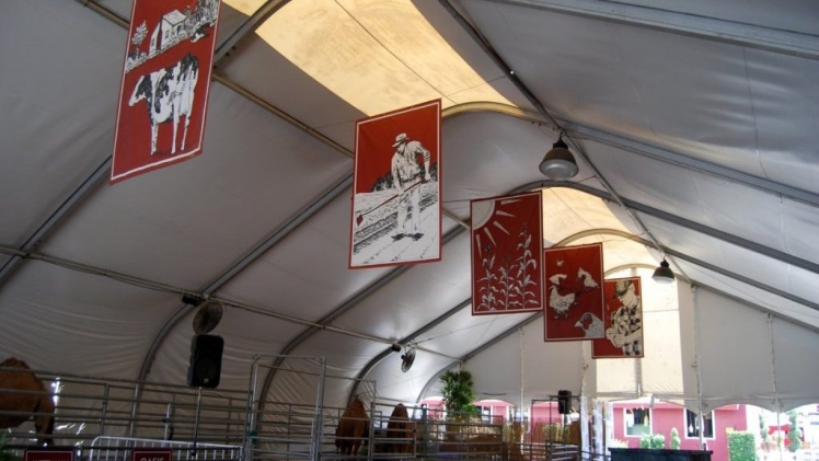
Vinyl banners for indoor and outdoor advertising represent the simplest and most cost-effective solution for ground-level advertising for businesses and organizations. There are several benefits of banner advertising. You can have the banners in any size and shape to suit specific locations and situations and display them in several ways. Modern digital printers can print banners in thousands of vivid colors replete with images, graphics, and text for maximum impact. Most importantly, since vinyl banners are affordable, you can customize them to suit every occasion and change them at will. However, for the banners to have the right impact, they must be designed right. Some pro tips:
Position the Banner Right
According to one of the top billboard printers, the biggest challenge for advertisers using banners is getting their target audiences to notice them. You should place the banners in places people will notice, which invariably means they should have a clear line of sight, be high enough not to get obscured by other things or buildings, and with enough light falling on them for easy reading.
Design for High Visibility
You can help noticeability by using a size right for the surroundings. Additionally, attractive graphics, images, and bold text can help people notice them more. According to Forbes, images should appeal to the emotion of the audience, not just mimic the message. The choice of the banner color is vital because if it is the same as the background, it is likely to merge and become difficult to notice. For example, a green banner against a grove of trees or a red banner against a brick wall may not get the desired noticeability. Using colors that pop and deliver a high contrast with the background color works well.
Choose the Text with Care
With people passing by engrossed in other things, they have only a couple of seconds to read and understand your advertising message. You must make the message crisp and compelling using the least number of words. Experts recommend a maximum of 15 words spread across three lines for easy comprehension. Make it a point not to use long, complicated, or obscure words.
Focus on Readability
If the audience cannot read your banner from where they are, your effort and investment will be wasted. You need to pick a font size they can easily read. A rule of thumb is the font should be 110 inches high for every 100 feet viewing distance. You also need to pay attention to the banner size. If the banner is too small or too large, it will affect noticeability and readability. Choose simple fonts that people can read on the go and avoid complicated and intricate designs that make the banner look messy from a distance.
Conclusion
While banner advertising is simple and affordable, you need to consider various aspects to optimize the design and placement to ensure people notice them and can read, understand, and recall them easily. Using large fonts, an attractive color palette, and a simple design is essential for the desired impact hertube .

